The user experience (UX) plays an important part in whether a prospect chooses to stay on your website or not.
And, with so many other options available today, it’s crucial to create an enjoyable experience for visitors in order to convince them to stay and, ultimately, buy from you.
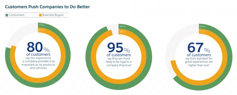
According to research, 79 percent of people who don’t like what they find on one site will happily jump ship and find another site that does have what they’re looking for. If you can create a site that makes people want to stick around, you’re onto a winner.
But how can you do that?
We’ve got some design tricks up our sleeve to get you started.
First Things First… Design with Your Buyer Persona in Mind
There is no point in even thinking about your user experience until you have a firm grasp of who your users are.
You can create the best experience in the world, but if it doesn’t resonate with the people you’re targeting then you’re not going to see the results you want.
When thinking about your B2B personas, consider questions such as:
- What company or industry are they working in?
- What are their responsibilities and tasks at work? Do they have any buying power?
- What is their job role and experience like?
- What are their biggest challenges and pain points when it comes to meeting their business and work goals?
- What brands, tools and products are they already using to make their job easier?
- What are their biggest objections and frustrations when it comes to investing in something for their job?
Once you can clearly answer these questions, you can start creating a user experience designed specifically for these people and their wants and needs.
1. Easy Navigation
Navigation forms a pivotal part of UX.
A confusing navigation system will have prospects clicking away from your site in no time at all, so your goal is to make the journey as simple and as easy-to-follow as possible.
This is particularly important for B2B brands, because buyers tend to already know what they want and will be heading straight for the specs, features and compatibility of your product or service.

Evernote’s business product has a visual, detailed navigation bar that pops up when users click on the “features” tab.
2. Make it Mobile Friendly
52.2 percent of all internet traffic comes from mobile devices and, while there might be fewer B2B buyers that fall into this category, it’s still important to design your website for mobile so those that view your site on mobile devices do have a good experience.
A good B2B UX means customers can visit your website from any device and still get the same high-quality experience. Think about common settings that your prospects might be in — such as meetings — where they might be browsing your site on a tablet or mobile device.
This means it’s important you make sure your site is responsive and looks good on all smaller devices.

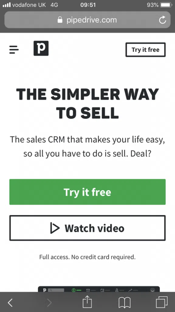
Pipedrive’s website works just as well on mobile as it does on desktop.
3. Choose Colors Wisely
Obviously, the visual elements of your design will play a huge part in your UX. If your images are blurry, the colors clash or it just doesn’t look visually appealing, you might turn off a number of prospects.
Of course, you’re going to want to infuse your website with your brand colors and visual elements, but it’s worth understanding a few key design practices that will help make the UX even better.
The quickest and easiest way to guide users toward taking the next step is to use some good-old color psychology.
For instance, contrasting colors work really well on calls to action. The key here is to choose a color that’s still on-brand but that also draws in the eye.

Batao does a good job of drawing the eye to its call to action (the “contact us” button) by using a bright red on a darker blue background.
4. Keep it Simple
It’s tempting to go over the top with your website design to make it stand out and set it apart, but this can actually do more harm than good.
This is because there’s a phenomenon called analysis paralysis, where B2B buyers freeze up in the face of too many options.
To provide a really sleek experience, nudge prospects to the next step in the journey by making it one of the only options.

Nutshell’s website is incredibly simple, with all design aspects pointing toward one, key action: sign up for a free trial. In the corner, Nutshell also has a “start free trial” button. This makes the next step for prospects a no-brainer.
Design is More Important Than You Think
Making your website look good is one thing, but making it user friendly and ensuring it provides an enjoyable experience is another thing entirely.
As soon as you start making little tweaks here and there to improve the experience your prospects have on your site, you’ll start to see more conversions, more sales and more enquiries.
Give these tips a go on your site, and see what a big difference it makes.
Related Articles:
Mobile’s impact on the B2B landscape
3 Ways to Apply Design Thinking to Your B2B Marketing Efforts
How Important is Responsive Web Design?
Why is Empathetic Web Design so Important?

