There is a ton of anecdotal information that supports the benefits of empathetic web design, including testimonials from businesses that have implemented it. But to truly understand the magnitude of how advantageous this approach to web design can be, it often helps to look at the facts.
Some statistics that highlight how influential emotions are in how people interact with online content include:
- According to an extensive 2007 case study analysis by the World Advertising Research Center, emotional ads outsell informational ones by 19 percent.
- Blue Sky Resumes (a service that helps people create resumes) saw a 65 percent increase in clients each month and an 85 percent increase in total revenues, simply by switching to a more emotion-focused design for their website.
- The profitability of advertisements with purely emotional content is approximately twice (31 percent vs 16 percent) that of those with only rational content.
- Eighty percent of the decisions humans make on a day to day basis are based on emotion.
These statistics show that emotion is a huge driving factor behind how people act, and the decisions they make.
Thus, your website has to cater to the emotions, thoughts, and feelings your users experience if you want to improve its performance.
What are some examples of empathetic web design?
Every good business owner knows that one of the greatest ways to discover what works is to study the results from companies who are already implementing a specific strategy.
Empathic web design is no different!
Many major brands are already using empathetic design techniques to drive more traffic to their sites and increase their conversion rates.
Some fantastic examples of companies that use emotion in their websites include:
MailChimp
MailChimp is a well-known email marketing service that is used by more than 311,896 companies worldwide.
Part of what makes MailChimp so successful is their commitment to user-centered web design and content.
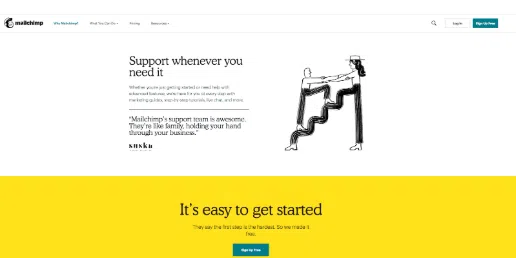
Notice how on the page in the image above, MailChimp caters to their client’s mindset by focusing on making things simple for their potential users (who are likely already multi-tasking in their professional roles and need a quick, easy-to-use tool to make their lives easier).
The design of the page is uncomplicated, with minimal text, and ample use of whitespace, reducing the amount of trouble the user will experience as they look for the information that is most pertinent to them.
Additionally, the content itself uses words like “support”, “easy”, and “we’re here for you”, emphasizing the effortlessness of using their products and services.
Asana
Asana is a web and mobile application that is designed to help teams organize, track, and manage their work.
Their website incorporates empathic design and emotive content in a variety of ways.
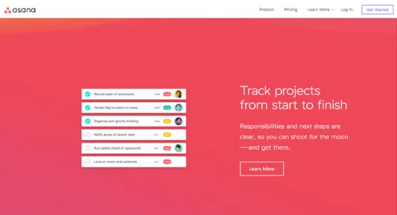
First, let’s focus on design. The website is extremely minimalistic when it comes to their color palette, as well as in regards to how much content they include. The site uses a clean, white background and keeps navigational options sparse, reducing the likelihood that users will get lost as they move throughout the site.
This appeals to the user on a subconscious level since they are likely looking for an organizational tool and came across Asana. Being led to an orderly, methodical website gives the user the sense that Asana is the solution to the clutter and confusion they are experiencing.
Additionally, the website uses content that appeals to the emotions their target audience may be experiencing. Phrases like “Make more time for work that matters”, “Turn all your goals into workable plans”, and “Make every project a success”, give users a sense of hope, an uplifting emotion that can be very influential when it comes to making a buying decision.
Zendesk
Zendesk is another compelling example of empathic web design. They excel at providing their website visitors with a user experience that is centered around their unique needs.
For their Sunshine software program, Zendesk created a visual identity that is firmly grounded in their “Sunshine” concept. The use of the color yellow, combined with strong visuals of the Sun, provide an overall sense of “newness”, and inspiration. The slogan “The Dark Days Are Over” also communicates to the user that their issue is about to be resolved – a positive feeling that leads to an improved customer experience.
The entire website intentionally focuses on conveying to the customer that Zendesk understands the inconvenience and pain points that they are going through.
Content such as “Take control of your customer data”, and “The freedom to build the best customer experiences”, make potential clients feel as though Zendesk truly understands the challenges they are facing.
Showing that your business cares about the concerns your customers have is a core aspect of empathic design, and Zendesk has certainly achieved this.
How can I better understand the emotions of my potential customers?
In order to build your website with the unique emotional needs of your client base in mind, you must determine what types of emotional responses your customers experience when interacting with your brand, product, or service.
Some methods of identifying the emotional needs of your clients include:
- Conducting a survey (Online tools like SurveyMonkey are great for this)
- Create a demographic profile of your target audience
- Pay close attention to how your customers are buying your product
- Do the majority of your customers buy online? Or in person?
- Do they typically watch a demonstration of your product first? Or take advantage of a free trial?
- Do your customers ask for more information, compare prices with your competitors online, or find it useful when a store representative assists them with their purchase?
- Analyze the reviews your customers leave on social media sites like Facebook and Twitter, compile the data, and make note of any common themes or complaints
- Calculate your Net Promoter Score to determine how likely your customers are to recommend your brand
- Create Use Cases for your products and services to better understand how your customers interact with your brand
What are some of the best ways to incorporate emotion in web design?
The most crucial part of designing and developing a website that meets the emotional needs of your customers is to be concise and straightforward with your intentions.
We recommended following these empathic web design best practices:
- Keep your messaging consistent. All of the elements on each page of your website should be coherent and identical in terms of branding and language.
- Consider Color Psychology when deciding on your visual branding
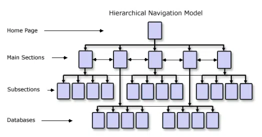
- Use intuitive, hierarchical and clearer layouts (See below)
- When appropriate, make use of jokes or humorous words/photos/animations to intrigue and captivate your users
- Make your messaging more digestible by using microcopy


